Paint Colour Is the Cheapest Way to Transform a Room and the Easiest to Get Wrong
A tin of paint costs a few hundred dollars. A professional repaint costs a few thousand. Neither is a huge investment compared to the rest of your renovation budget — but colour choices have an outsized impact on how your home feels every single day. Get it right and your flat looks cohesive, spacious, and personal. Get it wrong and even beautiful furniture can’t save it.
The challenge with paint colours is that they look completely different on a phone screen, on a physical swatch card, in the shop under fluorescent lighting, and in your actual home at 7pm with the warm lights on. Here’s how to navigate that properly.
Before You Pick Anything: Understand Your Lighting
Singapore’s HDB flats face in all four directions, and your unit’s orientation dramatically affects how colours read. A north-facing flat gets cooler, more diffused light all day — warm tones like cream and greige will balance this out. A west-facing flat gets intense afternoon sun that makes warm colours look almost orange by 4pm — cooler whites or softer neutrals work better.
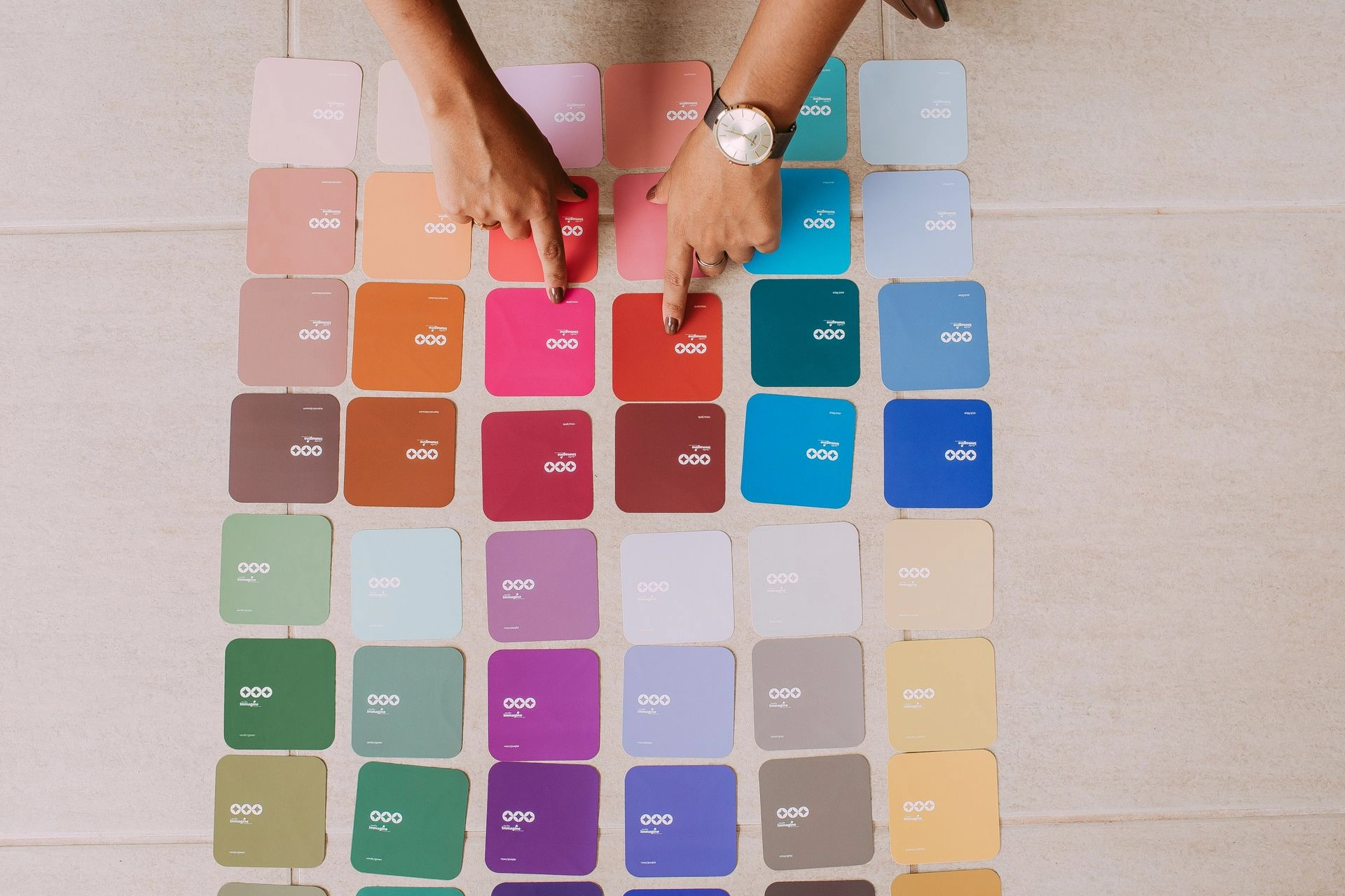
If your living room has a window facing the afternoon sun, test any shortlisted colour at that time of day before committing. Paint a large A3-sized swatch directly on the wall and live with it for 48 hours across different times of day. This is the only reliable test.
Living Room: Go Anchored, Not Neutral
The living room is where most homeowners play it safe with white — and end up with something that feels stark rather than clean. Pure white (especially cool-toned white) shows every scuff, bounces light harshly, and lacks warmth.
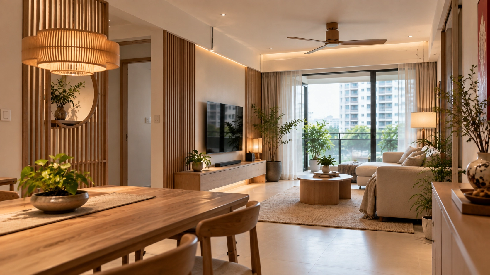
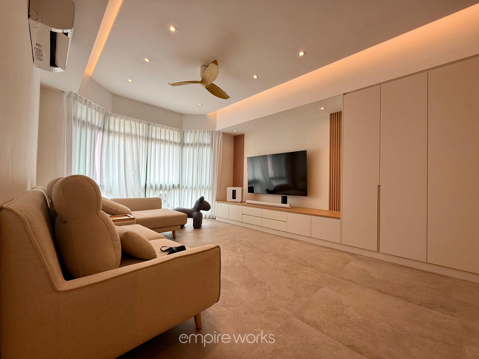
A better approach: choose a warm white (cream-based), a soft warm greige, or a very pale dusty sage. These read as near-neutral in daylight but feel much warmer and more intentional than stark white. If you want a bolder choice, limit it to one feature wall — the wall your sofa backs against or the TV wall — and keep the remaining three walls in a lighter complementary tone.
For Japandi-inspired living rooms, our Japandi interior design guide has detailed colour palette guidance that pairs beautifully with timber and linen.
Master Bedroom: Calm Over Interesting
The bedroom is not the place to show off your adventurous taste in colour. Its primary job is to support sleep — and research consistently shows that cooler, softer tones (muted blues, sage greens, warm greys, dusty pinks) lower resting heart rate and support relaxation more effectively than vibrant or saturated tones.
Darker, moodier colours — deep forest green, slate blue, warm charcoal — can work beautifully in a larger master bedroom and create a cocooning, hotel-like atmosphere. But they need to be paired with warm, layered lighting to avoid feeling oppressive. If your master bedroom is on the smaller side (as many HDB masters are), stick to lighter tones with one textured feature wall.
Our master bedroom design guide covers how colour, lighting, and carpentry work together in compact HDB bedrooms.
Kitchen: Practical Comes First
Kitchen paint has to deal with steam, grease splatter, and frequent cleaning — so durability matters as much as aesthetics. Choose a kitchen-specific or washable paint finish (satin or semi-gloss rather than matte) for walls near the cooking area.
Colour-wise, the kitchen benefits from lighter, brighter tones that make the space feel clean and open. Warm whites, light sage, and pale yellow all work well. If your kitchen cabinetry is dark (charcoal or navy), balance it with lighter wall tones. If your cabinets are light, you have more freedom with the wall colour.
Bathroom: Small Space, Big Impact
Because most HDB bathrooms are genuinely compact, colour choices here feel more intense than in larger rooms. Light colours make a small bathroom feel larger. Dark colours create a spa-like moodiness that can look stunning — but only if the bathroom has good artificial lighting to compensate.
A popular choice for Singapore bathrooms: light warm grey or off-white walls paired with a darker feature tile. This keeps the walls airy while the tile provides visual interest. For our full bathroom renovation guide including tile selection, read our HDB bathroom renovation article.
The Rule of Three: Keeping It Cohesive
Across your whole flat, stick to a maximum of three colours in your palette: a dominant tone (most walls and large surfaces), a secondary tone (soft furnishings and feature elements), and one accent (cushions, art, vases, plants). Every room can have its own variation of these tones, but they should all feel like they belong to the same family.
The most common reason Singapore homes feel visually chaotic isn’t bold choices — it’s too many different colours across rooms with no unifying thread.
Our Painting Team Is Ready When You Are
Empire Works’ painting contractors work with all major paint brands and can help you shortlist colours before your renovation begins. We also offer sample patch testing as part of the design process. Drop us a message to get started.